接著,此篇主要說明對齊的設定了,如何行的對齊?列的對齊?置中的設定等等…
CSS Grid Alignment + Centering
此篇會使用到 justify-* 與 align-* 的排列設定,* 號可能是 items 、 content 或 self ;
- justify-* 為行的對齊設定(橫的那個)
- align-* 為欄的對齊設定(直的那個)
items
設定容器內的元素對齊
place-items 可以用來取代 justify-tiems 與 align-items 的設定,可以將兩者的設定寫在一個
1 | justify-items: center; |

content
設定元素的內容對齊(文字之類)
self
設定元素與父元素之間的對齊(文字之類)
items 、 content 或 self
此三項的對比可以參照 W3C
資料來源 - W3C

其排列的對齊軸心線,可以參照 W3C

資料來源 - W3C
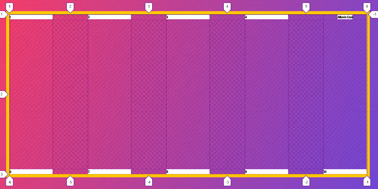
最後此篇練習的 css
1 | .container { |
線上展示
筆記與備註事項
justify-items
The CSS justify-items property defines the default justify-self for all items of the box, giving them all a default way of justifying each box along the appropriate axis.
資料來源 - MDN
justify-content
CSS justify-content 属性定义了浏览器如何分配顺着父容器主轴的弹性元素之间及其周围的空间。
資料來源 - MDN
預設值是 start ,語法中可以輸入的設定有以下:
- start 從行首開始排列。每行第一個元素與行首對齊,同時所有後續的元素與前一個對齊
- flex-start 從行首起始位置開始排列。每行第一個彈性元素與行首對齊,同時所有後續的彈性元素與前一個對齊。
- flex-end 從行尾位置開始排列
- center
- left
- right
- baseline
- first baseline
- last baseline
- space-between 均勻排列每個元素,首個元素放置於起點,末尾元素放置於終點
- space-around 均勻排列每個元素,每個元素周圍分配相同的空間
- space-evenly 均勻排列每個元素,每個元素之間的間隔相等
- stretch
- safe
- unsafe
align-content
align-content 屬性定義了當作為一個彈性盒子容器的屬性時,瀏覽器如何在容器的側軸圍繞彈性盒子項目分配空間。該屬性對單行彈性盒子模型無效。
資料來源 - MDN
justify-self
The CSS justify-self property defines the way of justifying a box inside its container along the appropriate axis.
資料來源 - MDN
參考資料
- CSS-Grid 課程
- 作者 Wes Bos CSS-Grid Github
- 我的 CSS-Grid 練習Github
- CSS Tricks