目標
運用 flex 製作一個動畫展開圖片的效果

處理步驟
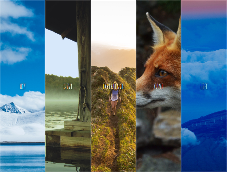
一開始的範本頁面如下

步驟 1
- 先調整
panels的 css ,將 display 設定為 flex 配置,此panels即為 Flex container - 設定
panel的 flex ,將 flex 設定為 1 ,設定一個數字為 flex-grow ,此為容器中空間的指定占比


步驟 2
上一步驟將各個 panel 當作 Flex item ,這一步驟中,將設定巢狀 Flexible box ,並讓元素顯示置中
- 將
panel的 display 設定 flex ,讓panel當作新的 Flex container ,將panel裡面的文字項目元素變成新的 Flex item - 設定
.panel > *此 Flex item 的 flex 為flex: 1 0 auto; - 設定
justify-content: center;將文字重新置中 - 設定
flex-direction: column;讓文字排列按照 column 調整 - 在
.panel > *設定 display 為 flex ,並加上justify-content: center;與flex-direction: column;,此設定是為了文字調整置中


步驟 3
- 先調整
.panel.open的樣式,添加 flex 的占比調整 - 針對文字 tag 的部分,設定
:first-child與:last-child的樣式特效隱藏 - 加入選取特效 css
.panel.open-active
步驟 4
此部分開始 JS 撰寫
- 取得所有
.panelDOM - 建立 toggleOpen function ,並將上述的 DOM 綁定 click 事件
- 建立 toggleActive function ,並將上述的 DOM 綁定 transitionend 事件
筆記與備註事項
JavaScript 部分
DOMTokenList
DOMTokenList介面表示了一個以空格作為分隔的內容集,通常來自Element.classList、HTMLLinkElement.relList、HTMLAnchorElement.relList或HTMLAreaElement.relList等屬性。本介面與Array同樣是由 0 開始索引,且DOMTokenList是區分大小寫的。
DOMTokenList.toggle()
The toggle() method of the DOMTokenList interface removes a given token from the list and returns false. If token doesn’t exist it’s added and the function returns true.
CSS 部分
flex
CSS 屬性
flex規定了彈性元素如何伸長或縮短以適應 flex 容器中的可用空間。這是一個簡寫屬性,可以同時設置flex-grow,flex-shrink與flex-basis
1 | /* Basic values */ |
Using CSS Flexible Boxes
CSS3 彈性盒子,又稱 flexbox ,是為了適應不同螢幕尺寸和顯示設備而生的佈局模式。針對許多應用而言,不用 floats 的彈性盒子模型會比塊狀模型(block model)易用,彈性容器的邊緣也不會與內容的邊緣重疊。
多數設計師會發現 flexbox 用起來比 box 簡單得多。像是不多注意
div的話,它就會經常違反設計師意願地,跑到頁頂去──令 footer 附著在頁底,也因此變得很棘手。flexbox 的寬高能改變以適應顯示空間,將較低的元件固定住。Flexbox 邏輯也能讓你確實令div壓在頁面的右方或底部。Flexbox 元素的顯示順序,與原始碼的顯示順序相互獨立。一些時髦的佈局,也能因而透過更簡潔的程式碼完成。這種有意的獨立性只影響視覺渲染,基於 HTML 原始碼的語意順序及瀏覽不會受到影響。
彈性盒子的概念Edit
Flex 排版的大致定義,是能更改該項目的長與(或)高,以便貼合任何顯示設備的空間。Flex container 能針對該元件擴張以便填補可用的空間、或收縮以便阻止空間溢出。
塊狀佈局(Block layout)以垂直方向為準、行內佈局(Inline layout)以水平方向為準、而彈性佈局(Flexbox layout)則同時允許這兩種。塊狀佈局雖適於頁面顯示,但在程式元件(application component)需要在用戶代理(user agent)變更、手機從垂直方向翻轉到水平方向……等變更定位、大小、拉伸、收縮的情形下,這種佈局就很難用了。彈性盒子佈局長於小規模佈局、而剛剛流行的格線佈局(Grid layout)則長於大規模佈局。二者皆為 CSS 工作小組為在不同用戶代理、書寫模式、和其他要求下的 Web 應用程式,提供良好互通性的一部分。
彈性盒子的字彙
在彈性盒子的世界,我們不會稱水平(inline)或垂直(block),而是主軸(main axis)與切軸(cross axis)。如果 flex-direction 是 column,主軸就會充當垂直、而切軸則充當水平。請參考下面的圖,它展示了一個彈性容器,裡面的 row 有 flex-direction,意味著該彈性項目會基於主軸,作水平排列。

flex-direction
CSS
flex-direction屬性指定了內部元素是如何在flex容器中佈局的,定義了主軸的方向(正方向或反方向)。
1 | /* The direction text is laid out in a line */ |
::before (:before)
::before會為當前元素創建一個子元素作為偽元素。常通過 content 屬性來為一個元素添加修飾性的內容。此元素默認為行內元素。
1 | /* CSS3語法*/ |
::after (:after)
CSS 偽元素
::after用來創建一個偽元素,做為已選中元素的最後一個子元素。通常會配合 content 屬性來為該元素添加裝飾內容。這個虛擬元素默認是行內元素。
1 | element:after { style properties } /* CSS2 syntax */ |
justify-content
CSS
justify-content屬性定義了瀏覽器如何分配順著父容器主軸的彈性元素之間及其周圍的空間
1 | /* Positional alignment */ |
translateY()
translateY()函數表示在頁面垂直移動元素.這個 transformation 具有特徵的就是通過<length>定義了元素垂直移動了多少
translateY(ty) 是 translate(0, ty) 的一種簡寫方式
1 | .transformed { |
參考資料
- JavaScript 30 day
- 作者 Github Wes Bos
- Js 30 day 中文指南
- 瓜瓜的 JS 30
- 我的 JS 30 練習Github