
Nesting Grid with Album Layouts
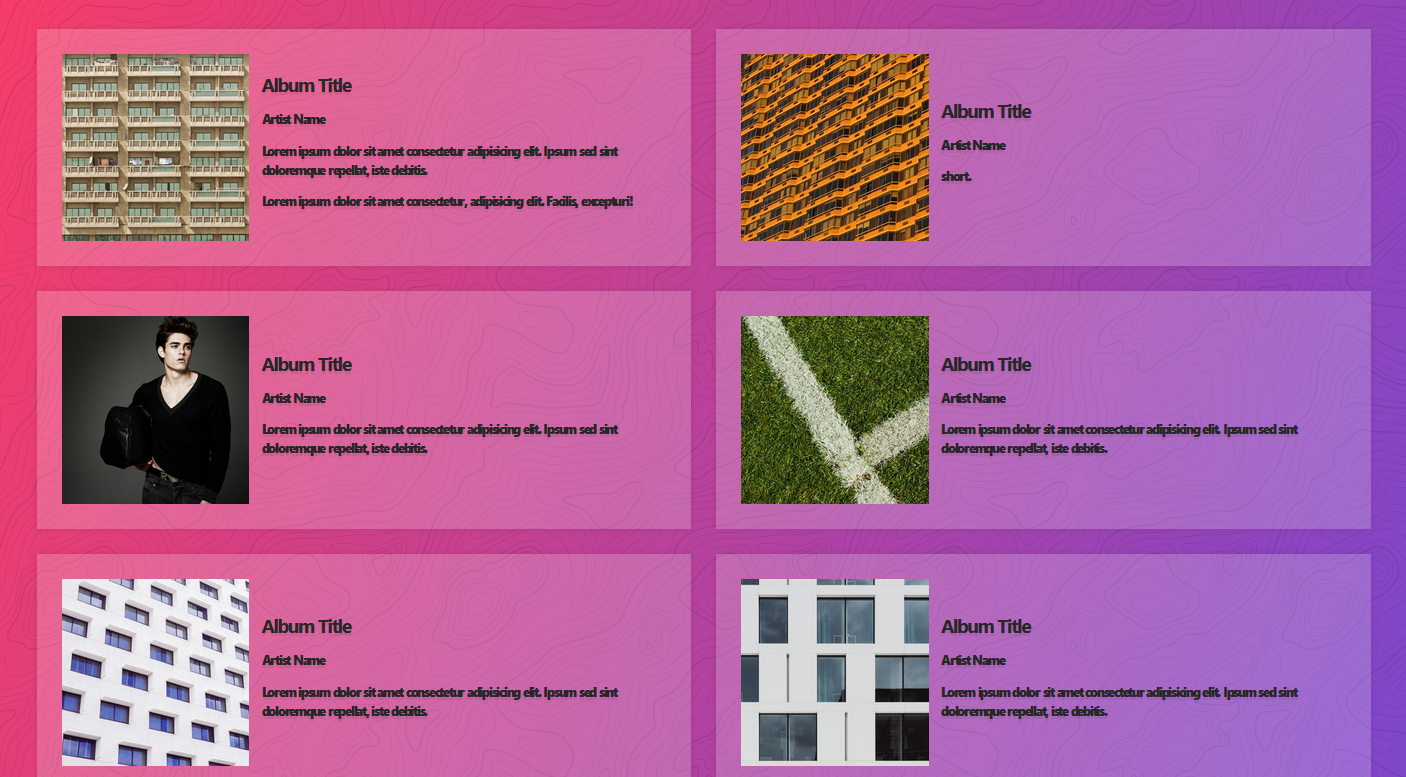
使用的都是前幾篇提過的運用,需要注意的是圖片的寬度沒有設定的話,就會按照原本圖片大小顯示,會超出 grid 配置的欄位

所以只需要設定圖片寬度 100% 就會縮放大小至 grid 的大小
1 | .albums { |
線上展示
參考資料
- CSS-Grid 課程
- 作者 Wes Bos CSS-Grid Github
- 我的 CSS-Grid 練習Github
使用的都是前幾篇提過的運用,需要注意的是圖片的寬度沒有設定的話,就會按照原本圖片大小顯示,會超出 grid 配置的欄位
所以只需要設定圖片寬度 100% 就會縮放大小至 grid 的大小
1 | .albums { |
歡迎關注我的其它發布渠道